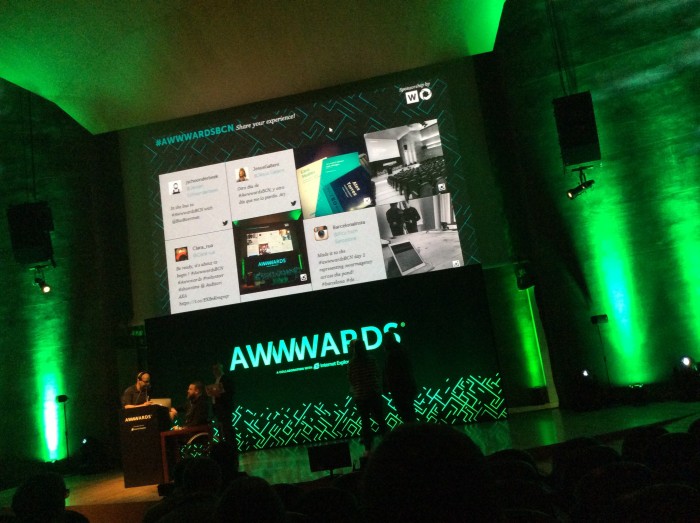
Conference venue was easy to find from my hotel, it was a building with nice clean lines and staff was very helpful. Coffee was nice and strong, despite coming from Nespresso machine.
Swags were sooo nice!
Book of use cases and a nice notebook with some tips of places to see in Barcelona.
Great fun welcoming talk from Josh Holmes @joshholmes, including raising the near fire alarm (none visible inside auditorium), no tweets and no selfies with firemen and/or fire before the fire is completely out.
So, here come the notes…
Haraldur Thorleifsson
Real artists ship
Designing something nice in photoshop is easy. Designing something that solves the business problem, gets through the multiple stakeholders, looks nice and eventually launches is a lot harder.
My notes:
Designers have loads of sketches, ideas, mocks, prototypes created but all sitting in cloud/drive without being published. Company UENO. How they setup rules to avoid lost projects…
Haraldur is from Iceland and he says that most people there are generalists, not specialists. There’s usually a small team and one man does-it-all is the designer.
His suggestions:
- Understand the project (don’t start with UI)
- Stop pitching (too early in project to do any pitch, understand the business first)
- Create your own wireframes (they use a ‘flat design turned gray’ to communicate and build trust and work on concepts and ideas) – showed sample for Dropbox user/admin guide.
- “A prototype is worth a thousand meetings”
- Photoshop lies (easy to create something beautiful, perfect, but not real)
- From idea to launch (ask the client how they think they will bring the idea to solution)
- Only deal with decision makers (clause on contract: “if you want to have an opinion you have to be in the meeting”)
A few examples of work: Dropbox user guide, Medium design, Google Santa tracker, Reuters TV app (video cast) @hthorleifsson – http://haraldurthorleifsson.com/
Bruce Lawson
<picture> and responsive images
Amaze your friends, confound your enemies! Oh, and save bandwidth and speed up your site by sending the correctly-sized images for the device with HTML’s new responsive images capabilities. Bruce proposed the new <picture> element in 2011, and it’s just gone live in Opera, Chrome and Firefox, so learn all about it now and put the techniques live tomorrow.
Fairy magic that works in browser! NOW all makes sense! #AwwwardsBCN @brucel
A photo posted by Monica Messaggi Kaya (@monicakaya) on
My notes:
<picture> tag and attributes Images are big and getting bigger, and not responsive properly. 3 years ago, retina images would be served no matter what, now you can serve the correct image size for each device.
Steve Souders, the “Galdalf” of performance said that:
preloading is the single biggest performance improvement bowsers can make
Media queries for video already existed and worked, so, @brucel and responsiveimages.org worked with the <picture>
Serving hi-resolution images properly – the only way to work is via the srcset, example:
<img src="'normal.jpg"" srcset="hi-res.jpg 2x, super-res.jpg 3x" alt="desc here" />
Serving ‘stretchy’ images:
<img src="medium.png" srcset="big.png 960w, small.png 240w" alt="desc" />
Different widths but showing with the size of 100% of the viewport. Order of the media queries matters, the first to satisfy the requirements ‘wins’. You need the <img> as last option of the <picture> to carry on with fallback to other browsers.
<img src="tree.jpg" alt="tree" />
Check his slides at: http://brucelawson.github.io/talks/2015/awwwards/ – @brucel
Tobias van Schneider
Side Projects are Stupid
Exploring the world of side projects and particularly why I believe side projects are stupid. The talk will bring light into this mystery.
My notes:
Tobias mentioned that side projects have to follow the KISS principle.
General concerns we have: not enough time, fear of failure, overthink, not the right moment, have kids and family, have to pay the bills, have to do research first, and all other excuses…
“The best way to complain, is to make things”. – James Murphy
A few of his projects:
- Authentic weather app (simple, funny phrases, etc.)
- Soundslike festival 2010 – open air festival – learning curve, not knowing about the process and all that was required.
- Les Avignon project, one of the members setup screenprinting for t-shirts, then tried out the long boards (‘it was just a stupid idea that received amazing feedback and could potentially turn to business’)
- His favourite project was Reflections, photographing reflections of these square glass objects and making artwork/prints/postcards. Playing with elements/objects and being creative without actually having an initial goal.
- 2D flat surface shader
- Semplice – Semplice is the first fully responsive case study portfolio system based on WordPress. Built by designers’, for designers’.
- Projects can also appear out of a simple personal motivation: make people laugh, example: PaP – Passive aggressive password machine
- .Mail – naively optimistic (but we need to know when it is enough) – this was a side project that was fun but then was not fun anymore… (n.b.: link to a review, Tobias doesn’t have link to the project anymore)
The Principles
- simple stupid (if people say it’s crazy and stupid, you are in the right path)
- ignore everybody (Huh MacLeod)
- trust your gut
- be a jack of all trades (to be able to see the big picture)
- stay busy (“it is faster to run when you’re already walking”)
Example: Casey Neistat – youtube videos skate boarding – self-taught film maker @schneidertobias – http://www.vanschneider.com/
Meagan Fisher
As designers we spend most of our time toiling over the graphic design principles we need to master, or the best way to create progressively enhanced sites. These skills are vital to our success, and worthy of our attention. But there are other things to think about that are just as integral to the quality of our work. What larger role does design play in an organization, and how do we shape it? What kind of culture should we foster within our teams? How do we choose where (or if) we focus our efforts, and how does the focus of our work affect the development of our skill set? In this talk we’ll step away from the keyboard and explore the interpersonal side of design.
In-person testing to gather feedback #AwwwardsBCN
A photo posted by Monica Messaggi Kaya (@monicakaya) on
My notes:
“The goal fo design is to provide the best possible solutions fo real human needs.”
Empathy as keyword
Where do we find constraints? – goals and limitations of the organisation, our aesthetic ambitions of a project (‘how we can solve this problem in the most beautiful way possible’), the needs of the users (failure of Coke creating the New Coke – without checking customers – and bringing back the ‘classic’ Coke; then Pepsi ‘crystal’ that didn’t taste good)
User on center of design process is well known but we fail to include the user quite often.
Innovation as keyword
Excuses: “User research belongs to someone else”, “I don’t now where to begin”, “It may raise inconvenient questions”, “It’s expensive and time consuming”.
Getting to know the user doesn’t have to be hard.
Interviews, remote testing, observation, analytics:
- In-person interview – recommendation: Silverback (Mac)
- Remote testing – recommendation: usertesting.com
- Observation tools – recommendation: fullstory.com (already using) and inspectlet.com (testing at the moment)
- Analytics gives insights on what is happening but not WHY.
Listen to what your users are already telling you.
Keep yourself reachable, create more personal emails (don’t need branding), asking what the users expect, what they will use the tool for, etc.
HelpScout – gathering feedback
Example/suggestion on being in touch with the customer: 15 min spending on random support tickets every morning, get notifications for tweets people send to the organisation, ask sales rep to listen in on a call once a week.
Getting all this empathy will give you:
- useful constraints
- meaningful content
- better critiques
- iterative changes
“Become a better communicator”
Books/reference:
- Practical Empathy – Indi Young
- Just Enough Research – Erika Hall
- Design is a Job – Mike Monteiro
- You’re my favorite client – Mike Monteiro
- UIE.com
http://owltastic.com/ – @owltastic
Marko Dugonjić
Responsive Web Typography
Responsive Web Design done correctly is based upon content rather than actual device resolutions, and so typography should adapt to both layout and sizing across content breakpoints. However, mere font sizing along the typographic scale based upon two-dimensional viewport @media queries is not enough. Apart from setting the correct balance of the black and the white in letterforms and texts, there are other important factors such as reading distance, information density, screen sharpness and device orientation that also influence the reading process. Learn to look at typography multidimensionally and enhance the overall responsive experience.
My notes:
Check Creative Nights (agency in Croatia)
Pantographia – accurate copies of all the known alphabets in the world!
Things to consider
1. Reading distance (basic font size, differs from device/medium) – He created a detection test at http://webdesign.maratz.com/lab/responsivetypography/realtime (dependent on user camera and permission of user)
2. viewport width height (imagine a bullet point in each phrase and if looks like bullet list is too much height, also consider diactrics – giving enough distance to differentiate them in between lines – and other characters)
Book to check: Inside Paragraphs
3. Content Hierarchy
Modularscale.com (Tim Brown) – test different ratios and http://webdesign.maratz.com/lab/subheads/
4. Information Density (quantity information you can see on screen)
5. Pixel density
check http://www.fontbureau.com/ReadingEdge/ – designed to function reliably at 9px to 18px also ia.net/blog/responsive-typography and font-to-width.com
6. Device Orientation
typologic.nl/news/live-font-interpolation-with-svg and typosansplomb.com/ResponsiveInterpolation
7. Aspect ratio
example with paper sizes perfectly aligned A0 to A6 and then all kinds of aspect ratios from devices (check his slides for the visual)
Article to read: Designing with context
All his slides are at: https://speakerdeck.com/maratz and the Awwwards Barcelona slides too.
Phil Hawksworth
Betting on the Web to #Win
The Web’s open nature has fostered ways of working which accelerate learning and innovation to an amazing rate. How do we keep up? How do we protect this asset for the future and can it compete with the fashionable application marketplace?
This talk will explore these themes and attempt to answer those questions by looking at case studies, examples and concepts from past and present.
A photo posted by Monica Messaggi Kaya (@monicakaya) on
My notes:
Phil works on R/GA (London) started as ad agency now they produce ‘other stuff’.
The Ted Nelson words (and his attempt at using them on the presentation) – hypermedia, hypertext, transclusion, intertwingularity, teledildonics, etc.
“Everything links to everything”
heich tee tee pee double meh – once you’ve seen it, you’ll never forget…
H T T P ://
Fashion and trends…. yes, trends appear and disappear. Standards and conventions versus trends.
Much more important now: accessible, stick to the principles you know to be true, resisting ‘the man’.
Check Google year in Search
‘We need to consider performance a design feature, not just a technical concern” – Yesenia Perez-Cruz via @philhawksworth #AwwwardsBCN
He mentioned Lonely planet style guide and highlighted that many others can be found at http://styleguides.io – also great article: A maintainable style guide
High level sitemap with sticky notes (and agile!) – example of his involvement on styleguide for google developers
The new way to Taco Bell isn’t on the internet it’s #onlyintheapp (problem about which App Store to cater for: Apple? Android, Amazon, other?)
Progressive enhancement is not about having javascript disabled, but to be conservative in what you do, be liberal in what you accept – Jon Postel
@philhawksworth – http://hawksworx.com/
Slides at https://speakerdeck.com/philhawksworth/betting-on-the-web-to-win
Paul Bakaus
Designing with Chrome DevTools
Paul is currently working on many design-specific features with the ultimate goal to make DevTools a tool for designers, as much as for developers. Come by for a sneak preview of crazy new things, such as improved responsive design controls, rich live editing of animations and more and more fun with colors.
My notes:
The anchorpoints: design, develop, iterate
Paul gave various examples of new features coming up (and some already in place) on the dev tools.
DevTools for designers for today – eye dropper can pick colour hovering on the page, with a few steps it will allow editing css/less/sass files straight from browser, the inspector shows exactly which font is being rendered.
Live editing in Dev tools, go to settings: workspaces – add the folder and allow editing (when question comes up), and in sources tab on browser you can map to file system resource (double check docs later).
(Note to self: I understood that works for CSS but does it work for less/sass? how about compiling?)
Other amazing features: Animations tab to control animation speed. Cubic bezier editor showing onion skin previewing how it will look.
You can play with the Google Canary version and check events.google.com/io2015/onsite for the effects
@maxwrk is a new designer at the dev tools team
“SCRIM” term and story: Smart, Colourful, Responsive, Intuitive and Material
S – typography and layout audits, flex assistants
C – colour swatches, gradient designer, colour theory
R – always-on, simplified device mode; device art and centered rulers
I – css transform builder, layout mode
M – material UI builder, material colours and animations
How to contribute?
- designers.chrome-dev.tools (Trello board)
- comment away
- add your own ideas and mocks
- ???
- profit
http://paulbakaus.com/ – @pbakaus
Aquest
A tomato, a picture, an elephant and a bunch of jugglers
Everything we talk about is inspired by the stories that frame our personal and working lives. There are seemingly few other experiences outside of those two contexts. What we have learnt – after all these years! – is that each story does matter. Every single story, from the smallest anecdote to the most profound tale, can become utterly unique and unequalled. What matters most is how you tell a story. We would like to tell you something of the diverse stories and experiences that have shaped who we are, and what we believe in. Let’s do that by discussing creativity. Creativity is a force that can change everything, turning all it touches into a work of art. It is a universal language that makes dreams come true.
My notes:
Stories allow us to be creative, be happy.
Helping hands – a picture story – #7mml an humanitarian project, around the world, and about food – creating a travel diary, photos, maps, instagrams, twitter, videos (youtube)
Apparecchiato – a tomato story – local food and ecomerce (buy fresh local and good food).
Scruud the vegetarians – a band of jugglers – game ‘scruud’, developed internally, (a bit like ‘angry birds’ IMHO)
Diumbo – an elephant story – app to meet people, approaches only ‘closer’ people to you so you can meet personally using only wifi triangulation.
“nothing to rethink, everything to invent”
Vitaly Friedman
Responsive Web Design: Clever Tips and Techniques
Responsive Web design challenges Web designers to adapt a new mindset to their design processes as well as techniques they are using in design and code. This talk provides an overview of various practical techniques, tips and tricks that you might want to be aware of when working on a new responsive design project.
My notes:
He started with a few examples on screen…
http://codepen.io/yoksel/pen/XJbzrO
http://codepen.io/lbebber/pen/ypgql
http://responsivelogos.co.uk/
Use of ‘ascii’ art in 1800s
C-fax / teletext – Vitaly getting embarassed explaining how it works to the audience.
The Smashing conference: dev.smashinmagazine.com
Considerations: components, strategy and layouts
Check Atomic Design by bradfrostweb.com/blog/post/atomic-design
http://rif.superfriend.ly/ (check the whole history of a project, from the big picture showing one big image/canvas with design elements, then refine and work up to a prototype/sample page, general look and feel)
At smashing magazine they try to define component behaviours for xs, small, medium, large, x-large and xx-large but undefined to exact pixel constraints
They also use a styleguide and boiler patterns on Drive just showing where they can shortcut depending on the type of components used for each project.
StyleDocco generates documentation and style guide documents from your stylesheets.
‘peta library api’ – ianfeather.co.uk/a-maintainable-style-guide/
lonelyplanet/rizzo (github)
– Design workflow –
slightly better linear workflow -> content . ux . design . front-end . back-end . launch!
Build smaller, tactical teams that are capable of executing multiple rounds of planning, design, and code quickly and independently. — Trent Walton
Ask the customer to prioritise instead of asking what it is important (after all, everything is important for the customer).
His trick: “fast-fake” a competitor URL loading time and show the client site using Slowy
Close and sign off the performance budget at this stage, since emotions are high and customer is concern that is performing badly compared to competitor. Later on, whenever the customer wants to add new features, give 3 options:
- remove existing feature to add new one
- optimize the new feature
- don’t add the new feature
(most of the time no feature is added)
Update (09/03/2015) – check my notes on Day 2.
Conference site: http://conference.awwwards.com/