I was happy to participate on the Responsive Day Out this year. Loaded with great speakers, some familiar faces and many tips, was a great way to either reinforce already acquired knowledge (from practice and other conferences I’ve been) and also learn some new interesting stuff!
Below are my humble notes but nevertheless “my” notes and I also included audio and slide links on this post. 🙂
The Responsive Workflow – Sarah Parameter – @Sazzy
Audio for this session
“You can create good experiences without knowing the content but you can’t create good experiences without knowing your content structure” – Mark Boulton
She mentions Mark’s post about the use of newspaper-like structure, saying that constraints are good and she likes to design with constrains. Check his writings at http://markboulton.co.uk/journal
She tested Browserstack (which I personally recommend, it is a great tool for testing your site in different browsers and OSs) with CrazyEgg for heat testing. It is good to know where your users’ click (and don’t click).
Sarah and her team are making use of pattern libraries which describe where and why to use an element within a site; but highlighted a difference in between pattern libraries and style guides – the latter just describes each element (this is a button, this is a quote, etc.)
Sarah highly recommend the use of Slicy which export PSD elements as assets for your website or app, including retina options.pp, including retina options.

She finalises that her process is adaptive and the work carries on.
Responsive Navigation – David Bushell – @dbushell
Audio – and – Slide for this session.
My notes:
Remember the fullscreen size not always is used as it is, user might resize the browser then you need to consider the viewpoint.
List navigation on mobile hides the content, try to use a smaller (two lines) menu. Check site Gloople and Clearleft website itself for examples of navigation when different screen sizes are chosen, pay attention on menus and icons.
Patterns used:
- Overlay (doesn’t push content down) – check Sony website on mobile.
- Off-canvas – his own website (similar to Path)
- Check ISO website ‘big footer’ on desktop and mobile.
But what about soul? blog post and menu brings a table of contents ‘with overlay’ on top of full page.
University of Surrey – focus away from menu on a more ‘magazine’ style for discovery.
Take-away: don’t overload menu; remember that feature detection is different than preferred usage; focus on discoverability (like the Surrey website); know your content hierarchy; single point of navigation = single point of failure.
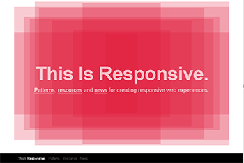
This Is Responsive – Patterns, resources and news for creating responsive web experiences. bit.ly/TIRWD
A responsive off-canvas menu using CSS transforms and transitions – bit.ly/offcanvas (he wrote)
“It seems that perfection is attained not when there is nothing more to add, but when there is nothing more to remove”. – Antoine de Saint-Exupery
Cutting the Mustard – Tom Maslen – @tmaslen
Works for BBC, working with many devices, supporting different browsers.
Audio – AND – Slide for this session.
Premium experience > Not rubbish (ok) > Not supported. They started building from ground up. Simple page across as many browsers possible. Use css (2) to style the main feature (without javascript). Then they create enhanced experience with javascript and they give it to browsers that only use querySelector, localStorage and addEventListener.
Change from graceful degradation to progressive enhancement.
Sofa talk: Jeremy chatting with Sarah, David, and Tom
Audio for this session.
Educating client, instead of ‘telling them what has to be done’. Also experimenting with technologies and features without having the sign-off.
Responsive Web Fonts – Richard Rutter @clagnut
Audio – AND – Slide for this session.
Options:
1. default appears at it loads
2. dont’ send webfonts to small screens
3. show tet in the fallback fonts until all web font loads
4. swap fonts one by one as they load
Use a webfont.css and use media=”all and (min-width: 569px)” (or similar code):
<link href="webfont.css" rel="stylesheet" media="all and (min-width: 569px)" />
Web font loader – The WebFont Loader is a JavaScript library that gives you more control over font loading than the Google Web Fonts API provides. The WebFont Loader also lets you use multiple web-font providers. It was co-developed by Google and Typekit.
Asset Fonts – Josh Emerson @joshje
Audio – AND – Slide for this session.
Mentioned to use icons as fonts instead of bitmap versions. If creating something more complicated use SVG.
His step-by-step on Using Fonts for Resolution Independent Assets
Also, an amazing tool that I should be using soon: IcoMoon – is a custom icon font builder, which allows users to select the icons they need, and make them into a font. Basically you can upload an SVG file and download a font file.
Nice tip: remember to remove the text-to-speech option of icons using CSS, for example:
.icon:before{
  content:attr(data-icon);
  font-family:'xyz';
  speak:none;
}
Josh uses Fontforge to create font sets. He created forecast.is using Climacons icons. The project can be found at: github.com/joshje/forecast

He also mentioned about the ligatures used on the fonts where instead of just leaving a symbol on the font set you can give it a meaning, so the ‘sun’ icon would have a ‘sunny’ meaning for his forecast.is application, and on the html what would appear is a legible ‘Sunny’ instead of any code. However, ligatures have to be set on browsers, using:
-webkit-font-feature-settings: "liga";
-moz-font-feature-settings: "liga=1";
-moz-font-feature-settings: "liga";
-ms-font-feature-settings: "liga" 1;
-o-font-feature-settings: "liga";
font-feature-settings: "liga";
Design Systems – Laura Kalbag – @laurakalbag
Audio – AND – Slide for this session.
We have multiple devices and would like to have consistency across. (My obs: she gave a very nice presentation and selected great icon sets)
We have to have balance between Ideals and Practicality.
Core of the design system:
- typography (the most-like item you will have on a website)
- layout
- shape/form
- colour
But also:
- userflow
- content strategy
- tone of voice
What you are going to make it similar and what it would be differentiate in between different ddevices. She advocates same content no matter what device.
We should detach our design from the viewports, they will be different, and continue to grow different.
Do not stick to one tool, choose the best tool for the job today. Examples:
Mockup to create design ideas to developers, clients, etc. but mockup on different viewports – how the design “might look” at some different devices and points in time – (optimum points according to context).
Audio for this session.
Right or wrong directions? – people ditching responsive design because only 2% of their users use mobile (the article I believe he was quoting is https://gocardless.com/blog/unresponsive-design/. Speaker said it is not just about mobile, RWD is/should be design agnostic.
Risky, Wild Decisions – higher cost to companies/people in a way is an investment on yourself, on your skills, on the people in your team. Important for a designer to code too, at least the basic html/css to be able to test on browser.
Sofa talk with Laura, Elliot and guys from Clearleft
Audio for this session.
“the web has been always free” we’re starting to use it as before again, with the tools as advantage to go beyond to the default. Using the tools/knowledge instead of trying to retro-fit.
Mobile website can be the starting point for some business, but often (in their opinion) it can be replaced to a fully responsive site.
Careful in creating high expectations: creating the Photoshop mockups can be dangerous, high-fidelity and ‘perfect’, where something online will be different depending on the browser.
Font Squirrel and IcoMoon – subset of fonts.
Audio – AND – Slides for this session.
Although devices are becoming ever more powerful and feature-rich, less capable devices continue to be developed as well. Paul Lloyd – The Web Aesthetic, A List Apart
Audio – AND – Slide for this session.
Contentencoding: gzip
Cache control maxi-age
Page load
Content, enhancement, leftovers
Script loading using
trade off on CSS
If (iswidedevice): Load larger CSS
Responsive server: relies on device detection,
Trade off on webfonts: progressive enhancement: support woff and fonts in local storge.
Trade off on responsive images: oocss, SMACSS, module patterns, systems, components – instead of media queries and they shouldn’t refer to media queries.
Picture element – use of image according to size of view port.
Lanyrd.com/ckwqy
What’s Next in StandardsLand – Bruce Lawson – @brucel – brucelawson.co.uk
Audio – AND – Slides for this session.
CSS device adaptation
@viewport {
Min width
Max width
}
Karen Luke website
Choice of filling viewport or not.
Flexbox
FixMyStreet hack without flexbox
Media queries level4
Pointer events spec smus.com/mouse-touch-pointer
John Hicks – http://www.hicksdesign.co.uk/
WebP lossless images 26% smaller in size compared to pngs and jpegs.
Image replacement:
Background-image: url(),
Background-image: image(.webp, .png),
Opera presto. Html5 video with media queries
http://responsiveimages.org – @respimg
Sofa talk with Andy, Bruce and Anna
Audio for this session.
No body know better than audience.. They told a story that a blind man entered a skateboard store asking for a skate and sales person said: “how? why? you are blind!” but the skate was for his son. The store could potentially lose a client there…
Antiphonal Geometry – Owen Gregory
Audio – AND – Slides for this session.
Book recommendation: The Elements of Typographic Style by Robert Bringhurst
Device Spect ratio 3/4
Viewport percentage lengths
H1 font size 8vh
P font size 5vw
Article width 8vw
Chech ALA 362 – The Web Aesthetic
The Edge of the Web – Paul Robert Lloyd – @paulrobertlloyd
Main: is meaning, design is enhancement
CSS img replacement on CSS, image src in content, data image in decoration
Responsive Markup Patterns – http://paulrobertlloyd.github.com/responsivepatterns/
New layout for NY times – http://www.nytimes.com/skimmer/
In between – Mark Boulton
Audio – AND – Slides for this session.
Edges are knowable
Lots of people say “we broke the web”, we didn’t, we transformed the chaotic fluid web to something more comfortable.
To get rid of this discomfort forcing the fluidity. “fluid first design” then progressive enhancement and lots of tweaking.
The
Responsive Day Out website has audio recordings of all 17 sessions (downloadable mp3) and also some of the slides from the speakers; the Lanyrd website have a
complete coverage with pictures, audios, videos, slides and other blog posts from people that contributed to document this event.
